Question graph gets more granular statistics for iOS version 2.14

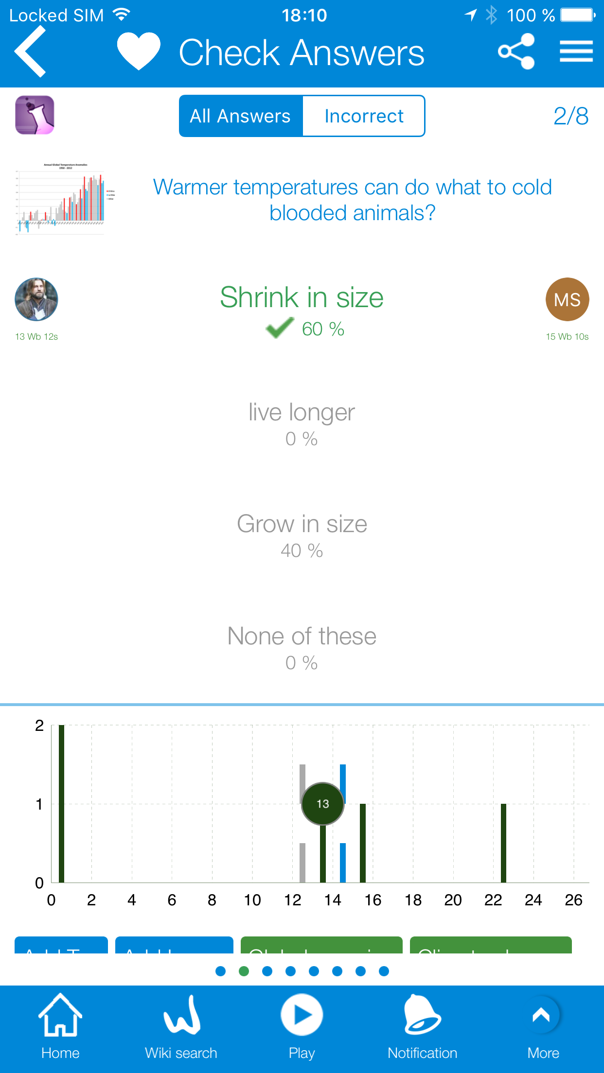
WikiMaster lovers have used the Quiz graph in review challenges and quizzes for months now and enjoyed the visual overview comparing results with opponent and average. Now WOK introduce the graph on a single question in WikiMaster version 2.1.4: Question graph!
"Fortunately, human forgetting follows a pattern. We forget exponentially. A graph of our likelihood of getting the correct answer on a quiz sweeps quickly downward over time and then levels off. "
Gary Wolf
You can compare your result with all wokers on a granular level in a single question level in Review question module from Footer or from Review Question in the Review Quiz mode. The Question graph will give you a visual distribution of WOKbits earned with an average in grey and a median bar in blue to compare your result on a first time basis leaving the repeated bias results out. We hope you like this statistics possibility just as much as we do. You will see your result in the question graph as a circle with grey, green or golden depending on if WOKbits earned or if you have the record WOKbits in a single question. You will get the quick overview if the question is hard or easy this way which makes WikiMaster even more enjoyable. Keep playing while we keep focus on enhance the fun in the Knowledge Network WOK!
*News in 2.1.4 for iPhone and iPad in AppStore
-Added WOKbit/WOKers Graph for every question in Review Quiz and Review Challenge pages; accessible through pressing the small WOKer icons beside the alternatives.
-Added WOKbit/WOKers Graph in Edit Questions page by pressing on grey WOKer icons on botton left corner.

